Reports & Analytics
Reports is where you stop guessing and start running the shop on numbers. Five owner-facing dashboards turn every receipt, order, expense, and timecard into the answers you actually need: when are we busiest, who keeps the lights on, which branch is winning, who's pulling weight at the counter, and did we make money this month after everything is paid. About 4 minutes.
Opening any analytics page requires the View reports permission (reports:view). The default Owner, Admin, and Manager roles all hold it. Cashier does not, so register staff can ring up sales without being able to read shop-wide KPIs, top-customer lists, or the bottom-line P and L. To let an accountant or branch head see the numbers without granting wider dashboard access, create a role with View reports plus Sign in to dashboard from Roles & Permissions. Without the permission, the dashboard sidebar hides the Analytics group entirely and direct navigation to any report URL redirects to the no-access page.
Before you start
Reports read from data the shop has already created at the counter and in the back office. None of the five pages let you edit anything, they only summarize.
You'll need:
- An active subscription. The five reports gate on plan tier, see section 1 below.
- Some real activity in the date range you're looking at. A brand-new tenant with zero receipts will see empty charts and no orders found placeholders. That's expected, not a bug.
- (Optional) Expenses and Payroll entries if you want Profit & Loss to reflect actual cost of operating. Without them the P and L treats your cost base as zero, which inflates the margin.
A global date range picker and a store selector live in the dashboard header. They scope every report at once, so switching to Last 3 months on Order Analytics carries over when you flip to Profit & Loss.
1. Plan tier and history limits
Different reports unlock at different tiers, and the Starter tier caps how far back the analytics can read.
| Report | Available on |
|---|---|
| Order Analytics | Starter and above |
| Customer Analytics | Starter and above |
| Profit & Loss | Starter and above |
| Employee Performance | Starter and above |
| Store Performance | Pro and above |
| Tier | Reports history window |
|---|---|
| Trial | Full history (treated as Pro for 14 days) |
| Starter | Last 30 days |
| Business | Full history |
| Pro | Full history |
| Enterprise | Full history |
Starter tenants see a banner on every analytical page: Your plan limits reports history to the last 30 days. Upgrade for full history. The date range picker hides any preset that reaches further back, and the calendar disables dates older than the floor. This 30-day clamp applies only to analytics, not to operational lists like Receipts, Orders, or Customers, which stay fully searchable on every tier.
CSV export is a separate gate: Business and above can export. The Export menu still shows up for Starter tenants, but tapping Download CSV opens an upgrade prompt instead.
2. Open the Analytics group
From the dashboard sidebar, find the Analytics group near the bottom. Five entries live underneath:
- Customer Analytics
- Order Analytics
- Profit & Loss
- Store Performance (Pro only)
- Employee Performance
The screenshot above is the Order Analytics page, the most visually loaded of the five and the one most owners check daily. The other four follow the same layout vocabulary: a header strip with the title, a date range picker, an optional store selector, and an Export menu; followed by KPI cards along the top; and a grid of charts and tables below.
3. Pick a date range
Every report has a date range picker in its header. It works the same on each page.
- Preset dropdown: Today, Last 30 days, This month, Last month, Last 3 months, Last 6 months, Past year, Year to date, All time, and Custom.
- Two text inputs for From and To in MM/DD/YYYY format. Type a date and press Enter or tab out to commit.
- Calendar icon for two-month range selection.
The default range is the last 30 days on most reports, last month on Store Performance, and last 3 months on Profit & Loss to give the trend chart something to draw. Starter tenants see presets older than 30 days hidden, and picking All time lands on the 30-day floor.
The store selector sits next to your account avatar in the header and only appears once you have two or more stores. Set it once and every report rescopes. Order Analytics, Employee Performance, and Profit & Loss honor the per-store filter; Customer Analytics is tenant-wide (loyalty balances aren't per-store); Store Performance ignores it since the whole point is comparing stores.
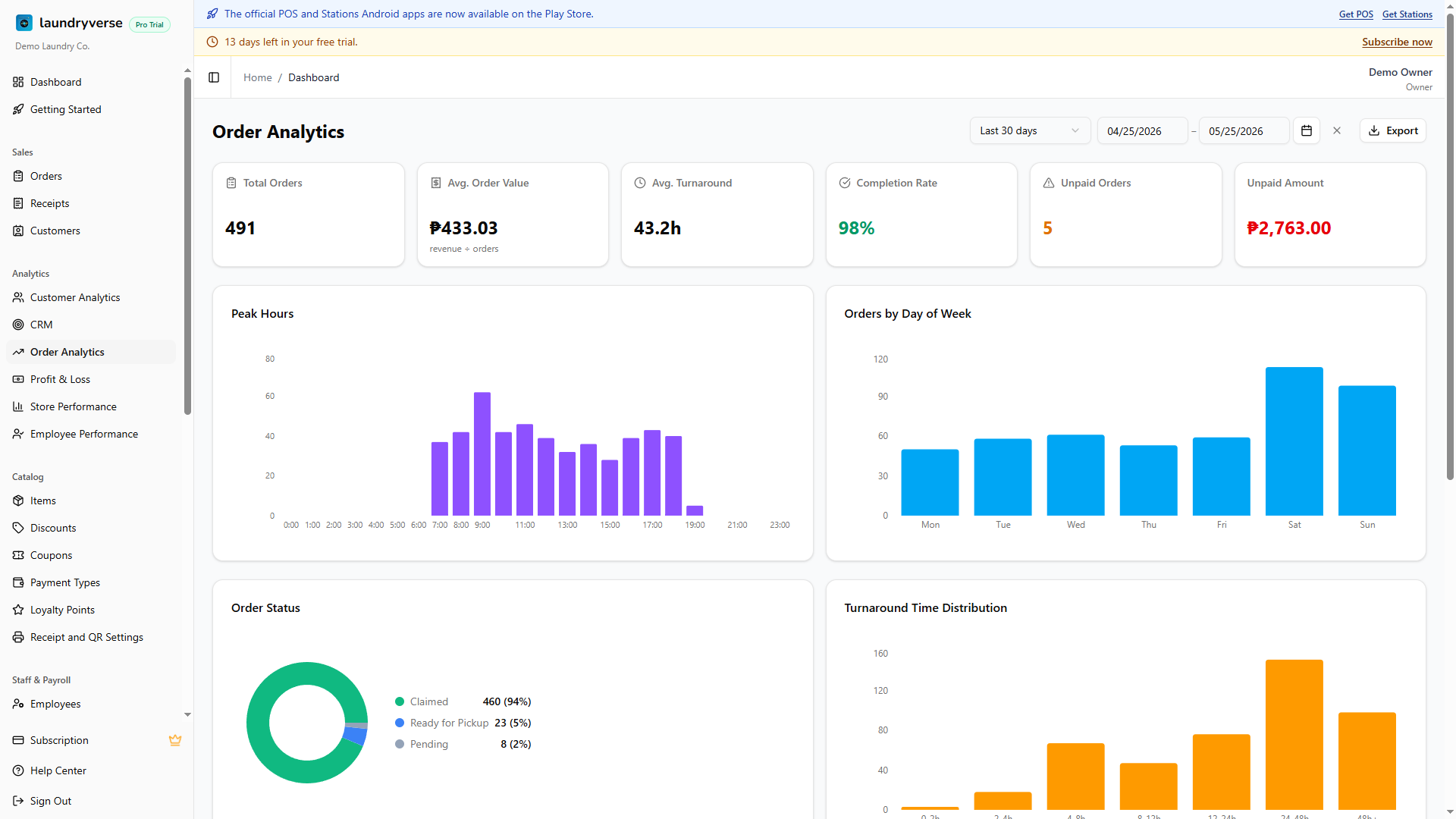
4. Order Analytics
Lives at Analytics -> Order Analytics. The owner's daily snapshot of what's moving through the shop.
| Section | What it answers |
|---|---|
| KPI strip | Total orders, average order value, average turnaround in hours, completion rate, unpaid order count, unpaid amount |
| Peak Hours / Peak Days | Bar charts of order count by hour of day and by day of week. Use them to set staffing and decide when to run promos |
| Status Breakdown | Donut of order statuses for the range (Pending, In Progress, Ready, Picked Up, etc.). Spikes in the long-tail statuses mean a workflow bottleneck |
| Turnaround Distribution | Histogram of how long orders spent from drop-off to pickup, bucketed (0 to 4h, 4 to 8h, 8 to 24h, 24 to 48h, 48h+). Heavy weight in the long buckets means orders sit at the Ready stage too long |
| Service Breakdown | Self-Service vs Drop-Off split, both as a donut and a daily stacked bar. Useful for shops running both wash-and-fold and a laundromat side by side. Edit the underlying service tags from the chart toolbar if categorization is off |
| Unpaid Aging | Table of orders still unpaid, grouped by age bucket. Action this during slow hours, customers forget |
The completion rate KPI color-codes itself: green at 80 percent or higher, amber 50 to 79, red below 50. Below 80 percent is usually a sign that orders are getting stuck somewhere between Ready and Picked Up, see Order Board for the stages a load moves through.
5. Customer Analytics
Lives at Analytics -> Customer Analytics. Answers who keeps the lights on.
- KPI strip: total customers, new customers in the period, average visits per customer, average lifetime value.
- New Customer Trend: line chart of new sign-ups over the date range. Granularity (daily, weekly, monthly) auto-recommends from the picked range.
- Visit Distribution: bar chart of customers grouped by visit count. A healthy laundry shop trends toward 70 percent or more in the repeat-visit buckets.
- Churn Segments: stacked donut of Active, At Risk, Churning, and Lost. The classification is by days since last visit, calibrated against the loyalty expiry window.
- Top Customers: ranked table by spend, with visits, last visit date, and a quick link to the customer's profile.
For deeper segmentation, including SMS reachability, expiry-soon loyalty points, and one-off campaigns, use the CRM page which sits in the same Analytics group.
6. Store Performance
Lives at Analytics -> Store Performance. Pro tier and above. Only useful once you have two or more stores; tenants with a single branch see a placeholder card explaining that the page compares multiple stores.
The page lays out three blocks:
- Revenue Comparison: side-by-side bars of Revenue, Expenses, and Payroll per store. Easiest way to spot a branch where Expenses or Payroll is eating into Revenue.
- Revenue Trend by Store: multi-line chart of revenue per store over the period. Useful for catching a store that's quietly sliding.
- Store Metrics table: one row per store with Revenue, Orders, Avg Order, Customers, Expenses, Payroll, Profit, and Margin percent. A Total row at the bottom rolls everything up.
CSV export breaks the entire table out by store and date, perfect for an investor update or a monthly review with branch heads.
7. Employee Performance
Lives at Analytics -> Employee Performance. Per-employee roll-up over the date range, optionally scoped to one store via the global store selector.
Four charts:
- Loads Processed: bar chart of total laundry loads each station-level employee advanced through wash, dry, and fold. Sourced from station-level status advances, not POS rings.
- Receipts: bar chart of receipts each cashier rang up. Activity volume rather than peso totals.
- Processing Time: average minutes per load per employee. Low and steady is good; spiky usually means one slow shift dragged the average.
- Attendance: total hours worked per employee, joined from Timecards.
This is not a substitute for direct observation. A cashier on the slow opening shift will look weaker than the closer just because traffic differs. Compare same-shift to same-shift, and pair the numbers with the Order Board view of who actually moved loads.
8. Profit & Loss
Lives at Analytics -> Profit & Loss. The bottom-line view that pulls revenue, expenses, and payroll into a single net number.
| Line | What it pulls from |
|---|---|
| Revenue | Active receipts (cancelled excluded) for the range |
| Payroll | Approved payroll reports falling in the range, see Payroll |
| Expenses | Logged Expenses for the range |
| Net Profit | Revenue minus Payroll minus Expenses |
| Margin | Net Profit divided by Revenue, as a percentage |
Charts on this page:
- P&L Trend: stacked bars of Revenue, Payroll, Expenses, and Net per period. Granularity (daily, weekly, monthly) auto-recommends from the date range. For a 3-month window it picks weekly; for a year it picks monthly. Override from the dropdown next to the chart.
- Expense Breakdown: donut of expense categories (Utilities, Supplies, Rent, etc.) for the period.
- Margin Trend: percent margin over time. A sliding line means input costs are creeping up without a corresponding price change on services.
This is the only view where Payroll is folded into the bottom line. The Expenses page on its own shows revenue minus expenses only and does not include staff cost.
9. Export and print
Each report has an Export menu in the top right of the header. Two options:
- Download CSV: writes the current view (date range + store filter applied) to a CSV file. Gated to Business and above; Starter tenants get an upgrade prompt.
- Print to PDF: opens a dedicated print-friendly version of the report in a new tab and auto-triggers the browser print dialog. Available on every tier. The print view strips chrome, fixes a clean A4-friendly layout, and includes the date range and store filter in the header.
Both honor the active date range and store selector exactly as they appear on screen. Save the PDF to file or email it to your accountant.
Common issues
"I see the Analytics group but the report opens an upgrade page"
The five reports check both View reports permission and a plan-tier feature flag. Order, Customer, Employee, and P and L need Starter and above; Store Performance needs Pro. If your subscription is on Starter and you click Store Performance, the page shows an upgrade card instead of the report. Either upgrade from Subscription or remove the link from your day-to-day workflow. If the subscription is on Pro and you still see the gate, the status may have lapsed; check Subscription for the active state.
"The chart says zero but I have receipts in that range"
Three things to check. First, the store selector in the header. If it's set to a specific store, the report only counts that branch. Switch to All Stores and the totals fill in. Second, the date range. The default is last 30 days on most reports, so receipts from 45 days ago won't show. Open the picker and pick a wider window. Third, that the receipts are not cancelled. The P and L and Order Analytics both exclude cancelled receipts from revenue, since a void shouldn't pad the totals.
"Starter shows a banner about 30 days and presets are missing"
That's the Reports history cap. Starter analytics are bounded to the last 30 days so the shop can validate the feature before committing to Business. Upgrading to Business or above unlocks the full presets list, the older calendar dates, and CSV export. The cap only applies to analytical reports, the Receipts, Orders, and Customers pages stay fully searchable.
"Profit & Loss says my margin is 100 percent which can't be right"
The P and L treats your cost base as whatever you've logged. If Expenses is empty and Payroll has no approved reports for the period, the chart subtracts zero from revenue and the margin reads 100 percent. Log a month of real expenses (rent, utilities, supplies) and run payroll, then come back and the number will land somewhere realistic.
"Store Performance just shows a Single Store card"
The page only does its job once two or more stores exist on the account. With one branch there's nothing to compare. Add a second store from Stores, make sure you're on Pro tier or above, and the comparison views will appear. Trial tenants get Pro-tier access for the full 14 days so you can preview this page even on the free trial.
"The Download CSV button opens an upgrade dialog"
CSV export is Business and above. Starter tenants can still print to PDF or read the report on screen, but the CSV is gated behind the upgrade. Open Subscription to lift the cap, or use the Print to PDF option as a workaround for one-off reports.
"Employee Performance shows two cashiers but I have five"
Only employees who actually logged activity in the date range show up. A cashier who didn't ring a single receipt, advance a single load, or clock in during the period is omitted from the chart. Widen the range or check Timecards to confirm the missing employees were actually working.
What's next?
- Subscription & Billing: upgrade to lift the Starter 30-day cap or unlock Store Performance.
- CRM: deeper customer segmentation than Customer Analytics, with reachability and campaign targeting.
- Expenses: log shop costs so the Profit & Loss bottom line is honest.
- Payroll & Compliance: approved payroll feeds into P and L.
- Order Board: the underlying load workflow that turnaround and completion KPIs measure.
Stuck? Email [email protected]. The founder reads every message.